Idea and Inspiration
The goal of this project was to make something for the blog, which is about sharing my gaming hobby of course, but I thought when you remove that layer to it, the blog is really about sharing “me.” That said, it felt right to maybe make a cool new logo that I would be proud to show around for my own brand. Works with the blog too!
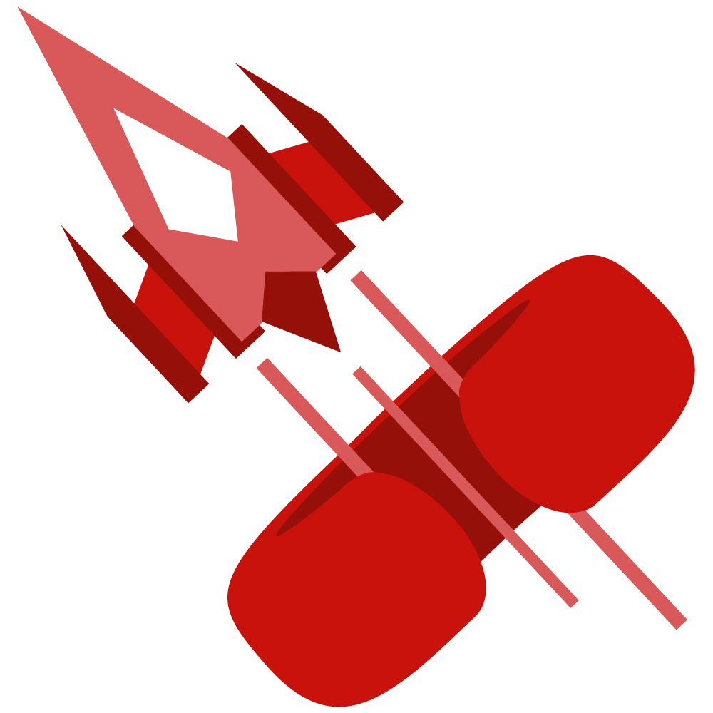
So there’s a lot to unpack here as the imagery I chose represents a lot about myself in various ways. The arcade spaceship motif is an obvious nod to my affinity for games and the future I want to have associated with it, but it’s also representative of my passion and influence for all thing sci-fi such as mecha and robot design. The oddly shaped “C” ring is an amalgamation of my first initial and being this abstract 3D shape that both represents my craft in 3D modeling, as well as vaguely resembling headphones for my audio creation. Finally the choices in shape and color are both elements of design that I hold dearly, as most of my creative endeavors strive for high energy and bold shapes.
Design Process
Originally I had a really hard time in the sketch phase of this project. Filling up over ten pages in my sketchbook of all sorts of designs, it was really hard to make something that represented “me” that I was satisfied with. Once I got to this design however, everything sort of clicked and quickly was able to get to this current iteration you see now. After some nice feedback from both my fiance and a classmate, I tilted the logo slightly more to make the “C” a bit more apparent, while also making it monochromatic so it wasn’t as busy with the previous shades of blue I had going on prior. Luckily spending so much time on drafting a design led to a fairly smooth progress to my final iteration.
Technical Detail
Instantly I struggled a bit in illustrator to make the “C” ring exactly how I wanted it to be. I ultimately found how to make a 3D torus using the 3D tools within the program and used that as a template to trace over with using spheres. Playing with the pathfinding and shapebuilder tools, I was able to whittle away a design I was happy with, and then mirrored half of it to ensure it was symmetrical.
As for the spaceship, it was much more straight forward to make. Using an assortment of rectangles, I stretched and layered them to make the desired object. Making the trails was slightly difficult as it at first didn’t want to play too nicely with the ring I made when cutting it with the pathfinding tool. Eventually all came to fruition however and ended up with a logo I’m proud to share!
Sources and Materials
All images used were created from scratch.
